一篇雅思小作文,求专业人士修改加评分,The curve graph describes the different demand of electricity in England between winter and summer,while the pie graph below illustrates the use of electricity in an average family.From the two cur
来源:学生作业帮助网 编辑:作业帮 时间:2024/11/24 19:54:45

一篇雅思小作文,求专业人士修改加评分,The curve graph describes the different demand of electricity in England between winter and summer,while the pie graph below illustrates the use of electricity in an average family.From the two cur
一篇雅思小作文,求专业人士修改加评分,
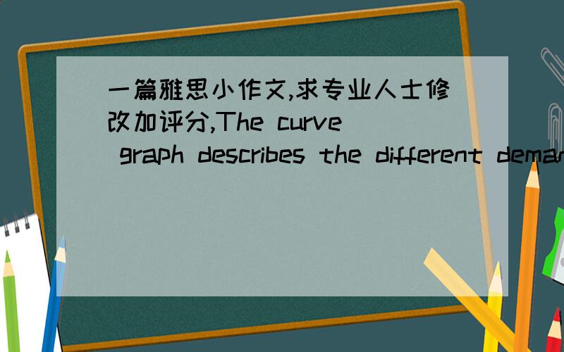
The curve graph describes the different demand of electricity in England between winter and summer,while the pie graph below illustrates the use of electricity in an average family.
From the two curves of the first graph,we can clearly see that the demand of electricity in winter is relatively higher than that in summer.As can be seen from the graph,the figure peaks at nearly 50000 units in about 23 o'clock,while that of summer is 20000 units in approximately 2 p.m.
The second graph,presented in a pie graph,shows the percentage of different use of electricity.we can see from the pie graph that 52.5% electricity is used to heating rooms or water,which possesses the biggest proportion.The percentage of using for lighting and the like is 15%,which is the same as that of using for electric tools or something else.
The statistics lead to the conclusion that electricity is most used to heating,and that's why the use of eletricity in winter is higher than summer
一篇雅思小作文,求专业人士修改加评分,The curve graph describes the different demand of electricity in England between winter and summer,while the pie graph below illustrates the use of electricity in an average family.From the two cur
The curve graph describes the different demand for electricity in England between winter and summer,while the pie chart below illustrates the usage of electricity in an average family.
From the two curves of the curve graph, it is clearly evident that the demand for electricity in winter is relatively higher than that in summer. As can be seen from the graph, the curve that acoounts for winter peaks at nearly 50000 units in about 23 o'clock,while that for summer is 20000 units in approximately 2 p.m.
The second graph, presented in a pie chart, shows the proportion in quantity for uses of electricity. We can see from the pie chart that a greatest proportion, 52.5%of electricity, is used in heating up rooms or water. 15% is used for lighting and the like, and another 15% for electric appliances and etc.
The statistics lead to the conclusion that electricity is most used to heating,and that explains the reason why the use of eletricity in winter is higher than summer.
Changed some phrasings to add clarity. The essay, however, is generally clear and sound. Keep it up.